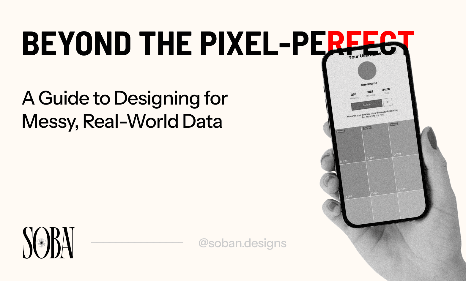
Look, we need to talk about the elephant in the room – or should I say, the perfectly-curated Dribbble shot in the room.
You know the ones I'm talking about. Those gorgeous UI designs where every username is "John Smith" or "Sarah Chen" or "Jane Doe". Every profile picture looks like it came from a professional headshot session, and every product description is exactly 2.5 lines long with perfect punctuation. Chef's kiss. Absolutely stunning.
But that's not reality, and we all know it.
The Dribbble Delusion
I'll admit it – I've been guilty of this too. Hell, we all have. You spend hours crafting the perfect user card, and of course you're going to use "John Doe" as the name because it fits beautifully. You're not going to test it with "Hubert Blaine Wolfeschlegelsteinhausenbergerdorff Sr." are you? (Yes, that's a real person. Google it if you don't believe me!)
But when your design goes live and actual humans start using it? That's when shit hits the fan.
Suddenly you've got:
Usernames like "xXx_DarkLord_Gaming_2024_xXx" breaking your navigation bar
Company names that are 87 characters long because apparently someone thought "The International Business Corporation of Advanced Technology Solutions and Digital Innovations LLC" was a good idea
Profile pictures that are... let's just say, creative choices (we've all seen the blurry cat photo used as a CEO headshot)
Bios that are either completely empty or a full-on manifesto about cryptocurrency and manifestation
And your beautiful, pixel-perfect design? It's crying in the corner.
The "Oh Crap" Moment
A little storytime for you: A few years back, I designed this really sleek and beautiful user dashboard with a bunch of statistic cards and user data tables. Looked absolutely fire in Figma. Name, role, a little bio snippet, profile pic – clean, minimalist, chef's kiss again.
Fast forward to handoff and launch day. I'm feeling pretty good about my work, refreshing the page, admiring my work. Then I see it.
One user card is... tall. Like, REALLY tall. Turns out someone's bio was a 400-word essay about their journey as a "digital nomad entrepreneur lifestyle coach." The card stretched halfway down the page like some kind of ancient scroll from Julius Caesar himself. Meanwhile, the card next to it had a user with no bio at all, creating this weird asymmetrical nightmare.
I literally said "what the fuck" out loud in the office. Good times.
Welcome to the Real World, Neo
Real users don't give a damn about your beautiful design system (and why should they). Good design is almost always unnoticeable. They're going to:
Upload a 5000x3000px image when you expected 400x400
Leave fields empty that you assumed would always be filled
Enter their name in ALL CAPS because THEY LIKE IT THAT WAY
Use special characters you didn't even know existed (looking at you, emoji-in-name people)
Write paragraphs where you expected a sentence
Write nothing where you expected paragraphs
And that's okay, that's how it is supposed to be. Actually, it's more than okay – it's your job to design for this chaos.
The Stress Test Checklist (AKA The "Let's Break Shit" Guide)
Enough doom and gloom. Let's talk solutions. Here's my personal checklist for stress-testing UI components. Think of it as the designer's version of "what's the worst that could happen?" but it's actually useful.
For Text Fields & Names
Test these scenarios:
Super short: "Jo Li" or just "A"
Super long: "María-José Carreño Quiñones de San Martín López" (yes, compound surnames exist)
All caps: "JOHN SMITH" (some people love their caps lock)
All lowercase: "jane doe" (some people hate their shift key)
Special characters: "O'Brien," "Jean-Luc," "Søren"
Numbers and symbols: "User123," "Alex_2024"
Resolve Empty state: What happens when someone just... doesn't fill it in?
For Profile Pictures & Images
Test these:
Missing image (no upload at all). Make sure to have a placeholder image for this scenario.
Comically low resolution (we're talking potato quality)
Comically high resolution (RIP your load times)
Weird file formats (someone's definitely going to upload a BMP file in 2024)
Inappropriate images (not NSFW, just... weird choices. Like a close-up of a sandwich). But honestly we can't do anything about this one, so might just leave it to the users (yeah I just found out free will exists)
For Bio/Description Fields
Test these:
Empty fields (someone didn't have enough time to write one sentence)
One word: "Hi"
One sentence: "I like stuff."
Multiple paragraphs: War and Peace but make it a Tinder bio
Special formatting: People WILL try to use HTML/Markdown even if you don't support it
Just emojis: "🔥💯🚀✨" (is this a bio or a SpaceX launch?)
URLs and emails that break formatting
For Lists & Tables
Test these:
Empty state (no items at all)
One item (does your design look weird with just one row or item?)
Hundreds of items (pagination is your friend here)
Items with wildly different content lengths
Null values (what happens when data is missing?)
Very long strings that don't wrap
Numbers that break your layout (e.g, a 15-digit phone number)
For Cards & Grid Layouts
Test these:
Varying content heights (some cards with 2 lines, others with 20)
Missing optional elements (tags, badges, secondary text)
Maximum possible content (everything filled out)
Minimum possible content (almost everything empty)
Odd numbers of items (what happens to that last lonely card in a 3-column grid?)
The "Dirty Data" Design Principles
After years of getting burned by real-world data, here are my rules of thumb:
1. Always Design the Empty State First
Seriously. After you design the "perfect" state, test your design to see what it looks like when there's literally nothing there. Empty inbox? Empty cart? Empty bio? These states are MORE important than your happy path.
2. Truncate Like Your Life Depends On It
Long text will happen. Accept it. Embrace it. Then truncate it with an ellipsis (...) and maybe a "Show More" button. Your layout will thank you.
Pro tip: Use CSS text-overflow: ellipsis, white-space: nowrap, and overflow: hidden. Or for multi-line truncation, check out line-clamp. It's like magic, but real.
3. Fallback Everything
No profile picture? Show initials or a default avatar (remember the placeholder image). No description? Show "No description provided." Never, EVER show just blank space or, god forbid, "null" or "undefined" to your users.
4. Set Character Limits (But Be Generous)
Yes, set limits on form fields. But make them reasonable. If you limit a name field to 20 characters, someone with a long name is going to have a bad time. Go for something like 50-80 characters for names – better safe than sorry.
5. Test With Real Content
Stop using Lorem Ipsum. Stop using "Sample User 1, Sample User 2." Get real (or realistic) data from your stakeholders or maybe a chatbot, or better yet, from actual users. You'll catch issues WAY faster this way.
6. Make Peace With Imperfection
Your design will never look as good in production as it does in Figma. That's okay. The goal isn't perfection – it's usability. If your interface gracefully handles a user named "Shawarma Enthusiast 007 🌮🥙🔥" with a bio that's literally just keyboard smashing, you're doing something right.
The Reality Check
Here's the thing that took me years to learn: designing for messy data isn't about planning for every possible edge case (you can't, and you'll go insane trying). It's about building resilient systems that bend instead of breaking.
Think about it like this – you're not building a perfectly staged IKEA showroom. You're building someone's actual apartment where they're going to spill coffee, leave their shoes everywhere, and hang weird art they bought at a flea market. Your job is to make it functional and pleasant despite the chaos.
Your Action Items (Because I Know You're Busy)
Enough philosophy. Here's what you should actually do:
Today: Open your current project. Pick one component. Throw some ridiculous data at it. See what breaks.
This week: Create a "dirty data" test file in your design tool with real-world examples of weird inputs. Use it every time you design something new.
This month: Do a full audit of your existing projects. Check error states, empty states, and "maximum content" states. Fix what's broken.
Forever: Stop designing with perfect data. Challenge yourself to use messy, realistic content from day one.
The Bottom Line
Look, I get it. Designing with perfect data is easier. It's prettier. It makes your portfolio look better. But you know what makes you a BETTER designer? Building stuff that actually works when real humans touch it.
Designing for your portfolio is way different than designing for actual products. Your users aren't going to grade you on how good your Dribbble shot looks. They're going to judge you based on whether your interface still works when they upload a 10MB image as their avatar or name themselves "Dr. William Henry Harrison Montgomery III, Esq."
So next time you're in Figma, and designing for an actual product, do yourself a favor: think about the chaos. Plan for the mess. You can keep the perfect data for your Dribbble or Behance shots. But, for real products, design for the real world.
Now go forth and break your own designs before your users do.
Drop a comment below if you've got your own horror stories about designs breaking in production. I'd love to hear I'm not the only one who's been traumatized by a 200-character username.
That's the tea, folks. Catch you later 👋
